
Buy a bike riding a bike?
Does that sound weird? Do people buy a bicycle costing several thousand euros via their mobile phone? The answer is: Yes, if the special user situation is consistently taken into account, i.e. everything is clear, runs smoothly and the product has enough "space" despite its low resolution to shine.
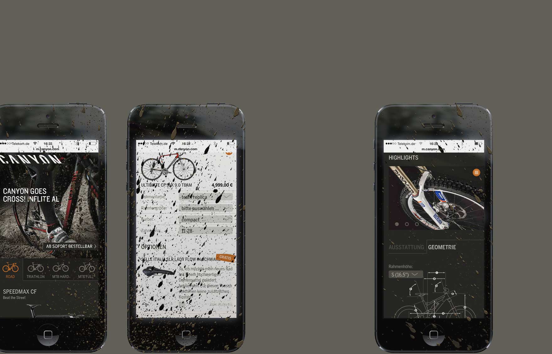
In this sense, the first task of the mobile project is to slim down relentlessly. While the desktop version of the Canyon website provides a rich offering of product, service and brand content, the mobile version was rigorously limited to two scenarios:
At first the user should be able to identify his desired Canyon and/or secondly be able to purchase it easily. That's why, on the one hand, he finds his suitable bike in helpful ways (categories, series pages, search with Autosuggest).
On the other hand, the process chain from decision to purchase is simplified in that the individual steps (selection, configuration and shopping basket) are clearly separated from each other. So the user can only be inspired at first, then only in the next step can he configure his selection correctly, so that he can finally complete the purchase in an uncomplicated manner.